Regular readers know that one of my stranger interests is in athletic uniforms.
I have argued, though generally without evidence, that there is a link between the aesthetic appeal of a uniform and how its wearer performs in athletic competition. That has led me to rant against such obscenities as black basketball shoes, the Michelin Man look (all-white uniforms, mainly in football), and uniforms without player names on the back.
SportsLogos.net has taken on this general subject by measuring, of all things, the win–loss records of baseball teams by uniform combination:
Have you ever thought to yourself, “it seems like those guys always lose when they wear that jersey”? Well, it turns out there may be some underlying truth to your sartorial assumption.
Over the past three-and-a-half months we here at SportsLogos.Net have been tracking each and every cap, jersey, and pants combo worn by every team in every game of the 2013 Major League Baseball season. We’ve cross-referenced that data with wins and losses, resulting in what I’m pretty sure is the first ever batch of MLB wins-per-uniform stats ever.
Of all the major professional sports, baseball has been the most, shall we say, color-challenged. Every other sport has had some combination of white uniform and colored uniform. Football usually wears colored uniforms at home and white on the road. Basketball wears white (or a light color) uniform at home and colored on the road. Hockey has gone back and forth.
Until the early 1970s, baseball had two uniforms: White at home, gray on the road. (Baseball also is the only professional team sport that doesn’t mandate player names on the back of uniforms, which tells you all you need to know about how baseball feels about fan-friendliness.) White-or-gray changed in 1971, when the Baltimore Orioles trotted out …

One year later, the Oakland A’s offended and/or blinded the purists by outfitting his team in, besides white — to be precise, “wedding gown white” — kelly green and “Fort Knox” gold jerseys and matching pants, thus creating …

(I’ve never seen an all-green A’s photo. Pitcher Vida Blue wore the all-gold ensemble in the 1975 All-Star Game in Milwaukee.)
That was matched by Pittsburgh, whose colors are, as is obvious, black and gold:

Other teams didn’t go as far as matching non-white pants, but did their own uniform thing. Some call the 1975–86 Houston Astros uniforms the “Tequila Sunrise” look; others call these the “Rainbow guts” uniforms:

The uniform train derailed in Chicago in the late ’70s:


What’s worse? White pinstripes on powder blue uniforms? Or the White Sox’s softball uniforms? (Including, in one game, shorts.)
Most of this went away in the ’80s … until, that is, baseball marketing entered the 20th century and the financial types figured out that baseball fans buy baseball jerseys. Now, the number of teams that regularly wear just white at home and gray on the road is limited indeed. (At the moment, the New York Yankees, Los Angeles Dodgers, Detroit, Philadelphia and St. Louis are the only teams to have not worn a third jersey, not counting the “holiday” uniforms every team apparently wore once this year.) Teams wear white pants (or cream in the case of San Francisco and Philadelphia’s alternate uni) at home and gray on the road (powder blue having almost completely gone away), but after that …
SportsLogos begin with the winningest, and losingest, uniform combinations in the baseball season before the All-Star break:


Here’s some irony for you. During the 1970s …

… early 1980s …

… and later 1980s …

… the Brewers wore two, and only two, uniforms: white at home, and gray, then powder blue, then gray uniforms on the road.
Which makes it ironic that apparently Milwaukee is the uniform capital of Major League Baseball:
Milwaukee has worn 10 different jerseys during the 2013 season, we’re not sure but that’s probably a record-breaking pace, however if they want to play good baseball (and let’s face it, this has not been their year) they should stick with the standards when playing at Miller Park. For home games the Brewers are 12-7 when they wear white, 10-19 in anything other than white. They’re a combined 0-5 when wearing special one-off jerseys, and a combined 0-6 when wearing anything other than their primary or alternate cap. Keep it simple Milwaukee, it’s working better for the club when you do!

Truth be told, this looks to me to be a couple uniforms short, because this graphic doesn’t include the Mexican …

… German …

… or Italian jerseys, which they may or may not be wearing this season.

For what it’s worth, I’m not a fan of the Brewers’ look, though it’s better than most of their previous looks. The name on the back and numbers are Times, last seen in your local newspaper. (Really.) The blue and gold color scheme was inherited from the Seattle Pilots, whose purchase and move to Milwaukee was so late in spring training that there was no time to design new uniforms. (The Milwaukee Braves, remember, were navy blue and red, and the literature from the late ’60s post-Braves pre-Brewers games held at County Stadium had Braves-color logos.) The colors were changed from royal blue and athletic gold (that is, yellowgold) to navy blue and metallic gold in 1994. (Green was added in ’94, only to disappear a few years later.)
Brewers tradition is that, other than on special occasions for which jerseys are made, the starting pitcher gets to choose which uniform is worn that night. The gold jersey looks just awful. The blue jerseys look good, at least, and the Brewers are doing marginally better wearing the blue road jerseys than the dull gray uniforms. If the Brewers wanted to emulate an actual winning Wisconsin sports team, the answer is obvious:

A team representing a town with German heritage should, you’d think, trot out the Old English/Germanish fonts. (Assuming they can find a legible one.) Too many baseball teams wear blue (including every iteration of the Brewers and Milwaukee Braves except apparently the pre-Braves Brewers), and blue is not a color one associates with beer anyway.
In fact, if I were outfitting the Brewers, they might look like …
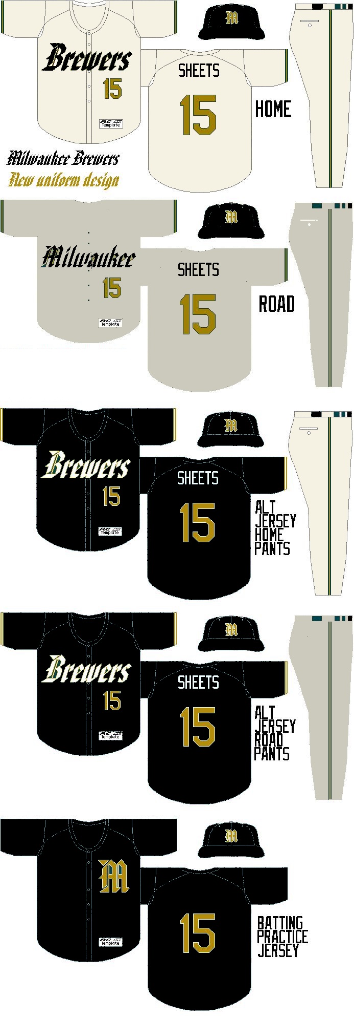 … beer colors. The home unis are cream, because Milwaukee was known as the Cream City. Metallic gold looks like beer, and black looks like dark beer. The road pants are the tannish-gray San Diego used to wear. (You may be able to tell I quickly recolored this based on something I did several years ago, hence the player depicted.)
Back to the hideous white pinstripes: The Cubs may have started the trend toward alternate jerseys because they unveiled these in the ’80s …

… the decade in which the Cubs actually played postseason baseball. (Twice!) And then they got rid of them …

… and returned to their usual ineptitude, until back came the blue jerseys …

… and the Cubs won every half-dozen years or so.
As for their crosstown rivals, after uniform choices ranging from uninspired …


… to excessively contemporary …

… the White Sox (not that you could tell their name from some of their uniform choices) finally settled on a look …

… with which they finally won a World Series, and from which they should never deviate again. This look is great enough to almost make you forget the worst announcer in baseball. Almost.


