One of my eclectic (or, some might say, “strange”) interests is in athletic uniforms. It’s probably similar to my interest in announcing sports I was unable to play due to my tragic lack of athletic talent. (I think I may have the worst hand–eye coordination of anyone not suffering from a neuromuscular disease.)
An entire website, sportslogos.net, is devoted to interest in athletic uniforms and logos, with an active message board. On my previous blog, I once previewed a Cowboys–Packers game by noting the fact that the Green and Gold was once navy blue and gold, and that the Cowboys have two shades of blue (the blue numbers and trim on their white jerseys vs. their darker blue jerseys) and three shades of silver (helmet, pants that go with their white jerseys, and pants that go with their dark jerseys). That one blog entry got more hits than any other blog entry I wrote in the three years of that blog’s existence.
This subject comes up because the Rose Bowl will feature Wisconsin, which has a quite traditional look, with Oregon, which has, between helmets, jerseys, pants, socks and shoes, literally hundreds of different possible combinations. If tradition follows and Wisconsin is the home team this year, you might see one of these looks:


Others claim Oregon will be the home team because they’re ranked higher. If that’s the case, the choices expand to include green, yellow, black and “carbon”:


As you can see, what Oregon wears couldn’t really be called a “uniform” by traditional standards. (And one assumes Oregon and/or Nike will loudly announce what Oregon will wear at the Rose Bowl sometime before the game. What the Rose Bowl should do is allow Wisconsin to wear its home uniforms and Oregon to wear whatever they want, since they will unquestionably contrast.)
What difference does Oregon’s one-uniform-per-game look make? Michael Kruse credits the uniforms for Oregon’s rise to the top of college football:
Oregon clearly is the beneficiary of its unique relationship with Nike boss Phil Knight, a 1959 alum who has used his fortune to give the Ducks every potential material advantage. But the most consistently conspicuous portion of Knight’s lavish contributions are the team’s much-discussed uniforms — the yellows and the greens, the blacks and the grays, the highlighter neons and the stormtrooper whites, the many different helmets and jerseys and pants and socks and shoes, the more than 500 possible combinations in all.
The football Ducks of Oregon are something new. They didn’t get people to watch because they got good. They got good because they got people to watch. They are college sports’ undisputed champions of the 21st century’s attention economy. …
Tradition? Tradition is great where it’s a sellable, marketable commodity. Alabama can sell tradition. Penn State can sell tradition. Michigan can sell tradition. At those places, tradition is the differentiation, but at the schools where it’s not? They have to go in the opposite direction. And no one has done that better, or more consciously, than Nike and Oregon, which for the purposes of this conversation are essentially one and the same. Oregon’s tradition at this point is the overtly embraced lack of tradition. Change.
Wisconsin tried the alternate jersey once. UW ordered special jerseys for its bowl game after the 1994 season, but they didn’t arrive in time for the game. So UW used these, a mix of the San Francisco 49ers throwback (from the 1950s) and the first Dallas Cowboys third uniform, both worn in the 1994 NFL season:

Wisconsin lost to Colorado 43–7 that night. Rest assured you will never see those uniforms in use again.
It shouldn’t be surprising that UW coach Barry Alvarez sees little reason to change, reports the Wisconsin State Journal:
Would University of Wisconsin coach Bret Bielema ever channel his inner Joseph Abboud and get funky with the Motion W?
“It’s his team,” UW athletic director Barry Alvarez said. “But I think he recognizes that we have a brand.
“I look at us like a Nebraska or a Penn State, like an Ohio State or a Michigan. … Our brand is that it’s a clean uniform. It’s two stripes (on the helmet), two stripes (on the jersey), two stripes (on the pants).
“We make subtle changes, but the basics are going to stay there. We’d be foolish right now (to change) because people see us (and) they see the flying ‘W’ and they know who we are. We worked hard for that brand.”
The problem is that by Alvarez’s own standards, a lot of the “brand” doesn’t work:

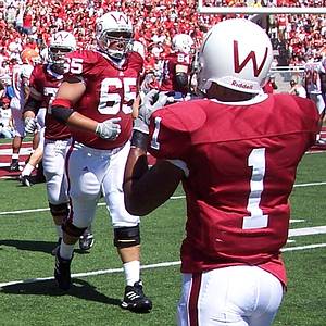
This photo is from the UW–Nebraska game, pitting the Cardinal and White against the Scarlet and Cream. Note that “cardinal” and “scarlet” are the same color. (So are “white” and “cream,” but that’s Nebraska’s problem.) The aforementioned two-stripe theme is merely a thinner version of Nebraska’s two stripes. And the jersey stripes clearly don’t work (as in they don’t go all the way around the sleeve, nor are they straight) due to the continuing shrinkage of jersey sleeves.
The correct cardinal color can be seen better in a photo from Wisconsin’s 2000 Rose Bowl win over Stanford …

… or, for that matter, in UW’s throwback tribute to the 1959 and 1952 Rose Bowl teams, which also is a better example of Alvarez’s dictum about “clean” uniform looks:
Nebraska traditionally has worn red (sorry, “scarlet”) pants on the road. The all-white look makes large players look fat, and makes the wearing school appear too cheap to buy more than one set of pants. The Badgers had red pants in the 1950s (which included UW’s first Rose Bowl trip, in 1953) and the 1980s (when UW was respectable in the first half of the decade). They have red pants today (worn in the 1999 and 2010 Rose Bowls) but don’t wear them enough (i.e. with the white jersey).
Another feature that fits within UW tradition, believe it or not, is red helmets:

The upper left two helmets are from the 1950s, including the first Rose Bowl team. Photos from those years show that the Badgers generally (though not always) wore the red helmets with their red pants for road games, and the white helmets for home games. The top-row far-right helmet was worn between 1967 and 1969, with the black helmet awarded for superior defensive performances. (The 21-game winless streak of those days demonstrates that there were few superior defensive performances.)
With Alvarez’s stipulation about a “‘clean look” and branding in mind, here is how Wisconsin could update its traditional look:
 This design incorporates several elements from past Wisconsin football history. The color is supposed to be back to the correct cardinal instead of the Ohio State/Nebraska scarlet of the past 30 or so years. The stripes are gone in keeping with going to the early-’60s contrasting-jersey-cuff look, and trying to look a bit less like Nebraska. (Hence the motion W on the stripe-free pant hips.) I also got rid of the most objectionable feature of the current look, the black shoes and black socks. (Black is not part of “cardinal and white.”)
The red shoes go back to the late-’90s teams, although I’d go for white shoes myself. (Black shoes make the wearer appear slow.) I’d put the numbers on the top of the jersey instead of on the biceps were it not for the fact that the cameras at Camp Randall appear to be aimed at the sleeves.
 The “Wisconsin” on the jerseys was a feature of the early-’80s teams’ bowl jerseys. The lone veer from tradition is in the numbers, which are supposed to look like the Badger font UW uses on, among other things, their basketball jerseys.
As for the helmets, since two other Big Ten schools wear white helmets (Nebraska and Penn State), UW could use them for games against the Cornhuskers and Nittany Lions, and white helmets against others:
 The blood-clot look could be reserved for Homecoming or other big games:
 One more non-red note going back to the Packers: One win or San Francisco loss in the season’s final three games will clinch the NFC’s number one seed, which will mean home games through the NFC Championship for the Packers. That means the traditional home look …

… until Super Bowl XLVI, because the NFC is the road team this year. Given that Green Bay’s road uniform is lacking in much green, may I suggest …


Leave a comment