Todd Radom admits to not being a great baseball player (join the crowd), but watched baseball in the 1970s because …
I was focused on Reggie Jackson’s titanic home runs, but I was also mesmerized by the green and gold Oakland A’s uniforms.
I doodled sports logos on school notebooks and conjured my own teams — not so much for games as for creating logos and uniforms for them. I studied the cap marks of Major League Baseball teams and rendered them in painstaking detail with felt-tipped markers and cheap ballpoint pens.
I was fascinated by the visual culture of sports, and I still am, having devoted my life to sports design. Lucky for me, as a young baseball fan, I hit the lottery: My formative sports-aesthetics years came in the 1970s, the game’s most vibrant, colorful decade, with its smorgasbord of audacious and often garish uniforms. Bold graphics and sensationally showy colors were synthesized into some of sports history’s most memorable uniforms — a golden age of sports identity.
Sometimes, the results were mixed — not unexpected, coming off baseball’s longstanding adherence to traditional aesthetics — but that was just fine by me. My formative years coincided with the opening of modern, multipurpose stadiums, color TV, and a new approach to what sports could look like, played by athletes with long hair and flamboyant mustaches. While any number of the uniforms were considered ugly by contemporary standards, they also projected a sense of optimism and a fresh take on a very visible and vital aspect of American popular culture.
New synthetic fabrics allowed for a far more expressive range of hues. As professional sports expanded to America’s Sun Belt, it welcomed new markets and new fans who were untethered to visual traditions that, in some cases, dated back to the years immediately following the Civil War. The Cincinnati Reds’ identity, for example, is tied to that of the original Cincinnati Red Stockings, whose roots date to 1866.
Professional leagues like the World Hockey Association, the American Basketball Association and the World Football League broke free from tradition. In 1974, the W.F.L. kicked off its inaugural season with yellow footballs, and one team— the Southern California Sun— took the field in magenta uniforms.
For me, though, the uniforms of Major League Baseball in this era were the greatest.
Take a look at images of the 1977 M.L.B. All-Star Game to see this period in all its chromatic glory. Yes, some players are clad in the traditional home whites and road grays, but scattered among them are uniforms in glorious powder blue, black, orange, red, yellow and brown — as well as one in rainbow.
The greatest ugly sports uniform of all time arrived in April 1975, when the Houston Astros revealed a new look, described as resembling “rainbow guts” or a “tequila sunrise.”
The pullover jerseys featured an alternating series of horizontal stripes, rendered in shades of orange, yellow and red, the word Astros spelled out above in clean, unembellished sans serif letterforms. A Texas-size navy blue star, nine and one-eighth inches high and placed squarely against the left side of the players’ bellies, punctuated the look.
Observers almost immediately slammed the “ugly” new look. That July, The New York Times compared the Astros’ togs to “a television test pattern.”
Tradition be damned. The Astros, renouncing baseball’s stuffy conventions, would wear the same uniforms at home and on the road. This made perfect sense, as there was certainly no mistaking the Astros for any other team.
Say what you will, the Astros looked like no other team, before or since — a singular, instantly recognizable identity.
The Astros’ look of the era might have been retina-scorching, but it perfectly reflected Houston in the mid-1970s: It was a can-do place where people migrated to dream big dreams, to drill for a never-ending supply of fossil fuels, to send Americans into space and to make money. Let New York have its austere, pinstriped Yankees, the visual embodiment of old money and Wall Street — Houston represented the future.
Baseball gave us plenty of other examples of ugly styles in those years. The back-to-back-to-back World Series champion Oakland A’s put together a dynasty in the ’70s, resplendently attired in what the team called “Kelly green, Fort Knox gold and wedding gown white.” At the other end of the spectrum were the hapless San Diego Padres, who bumped along through most of the ’70s clad in brown and gold, a look that first baseman Steve Garvey later compared to a taco.
The Chicago White Sox maintain an elevated place in the hearts and minds of ugly uniform enthusiasts everywhere. In 1976, the team owner, Bill Veeck, unveiled his team’s new uniforms. The graphic elements on the White Sox’ togs were conventional; white suits with old-fashioned navy blue letters that spelled out “Chicago” at home, with the colors reversed out on the road.
But they also featured floppy collared shirts, which were designed to be worn un-tucked. And “clamdigger” knee-length pants. And, in a spectacularly weird twist, even for the 1970s, the White Sox included shorts as part of their lineup of uniforms, a Major League Baseball first (and last). These were worn but three times, all in August, amid much ridicule and mockery, mostly from opposing players.
The Pittsburgh Pirates ensemble of the late ‘70s was a mix-and-match affair, centered around three jerseys, three sets of beltless uniform pants and two different flat-topped “pillbox-style” caps. The Bucs won the 1979 World Series in a decisive seventh game, attired in yellow-gold jerseys sandwiched by black caps and pants. They defeated the orange-clad Baltimore Orioles in a fitting conclusion for the final game of baseball’s most colorful decade.
Baseball’s Technicolor explosion of the ’70s gave way to something far more sedate and conservative during Ronald Reagan’s first presidential term. Buttoned jerseys started to replace pullovers, belts were restored to the uniform, and power blue road uniforms were supplanted by the traditional gray. In 1987 alone, roughly a third of all M.L.B. teams changed uniform styles, with each change characterized by a return to elements influenced by baseball’s mythic, distant past.
Fans have opined about the merits and misfires of their team’s uniforms since the middle of the 19th century. In 1909, the St. Louis Republic snarkily proclaimed “really, baseball uniforms are the ugliest things in the world.”
In today’s consumer culture, sports fans are the ultimate brand warriors. We wear our colors each and every day in the consummate display of brand loyalty.
The word “fan” is itself a shortened form of “fanatic.” This fervor extends to our feelings, both positive and negative, for the optics of sports. Sports fans are tribal in nature, and team branding helps to define their identities and to propel sales of licensed merchandise.
Last July I attended the M.L.B. All-Star Game in San Diego. A sea of players and coaches were lined up along the first and third baselines for the pregame ceremonies. Unlike their predecessors in the 1977 All-Star Game, every American League player was clad in white, and every National League player wore gray — they formed a vast, monochromatic sea of sameness.
I had read about the A’s green pants, as well as their gold pants …
… but I had never seen the green pants until now.
Game seven of the 1979 World Series was a water mark of some sort:
The author certainly could have added to this list the Cleveland Indians’ “blood clot” uniforms of this era:
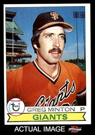
Or, for that matter, the San Francisco Giants’ pre-1983 uniforms:
Perhaps the All-Star Game was white vs. gray, but it seems as if every team has more than just white home jerseys and gray road jerseys, particularly the Brewers …
… who have navy blue “BREWERS” and “MILWAUKEE” uniforms, and have, or have in the past, had …
Throwbacks to the 1982 World Series team.These emulate a Negro League team; the Brewers will wear these against Cincinnati Aug. 12.An alternate throwback? The Brewers never wore these, but the style is based on their 1980s uniforms.“Cerveceros” is “Brewers” in Spanish.Gold jerseys.
“Birrai” apparently means “Brewers” in Italian.
Every MLB team — even the Yankees — will have four additional specialty uniforms, for Mother’s Day …


Leave a comment