… Packer uniform designs, of course. (You know I’ve covered this subject in the past.)
These two redesign proposals were passed on by WTMJ-TV in Milwaukee, one from Facebook’s Mr. Design Junkie …

… the other from Baker of the Twin Cities …

… which has less traditional proposals as well:


Why does this come up at all? Can’t you gue$$, $illy?
To evaluate these properly requires looking back at previous Packer uniform designs as chronicled by the excellent Packers Uniforms blog …

… including clearing up some misinformation.
The Green Bay Packers started looking Notre Dame-ish because Curly Lambeau attended (but did not graduate from) Notre Dame. Though they wore green uniforms as early as 1935 …

… green wasn’t permanently one of the colors until Vince Lombardi showed up. Once plastic replaced leather for helmet construction, the Packers usually used gold helmets, though they occasionally wore white. Once color other than tan started being used for pants, the Packers usually wore gold pants, though they occasionally wore white pants and green pants.

The Packers even sometimes wore an all-gold look — apparently mixing metallic gold helmets with yellowgold jerseys and pants — proving again the maxim that just because you can doesn’t mean you should:

Today’s green appears to be a compromise (by Lombardi, his equipment manager “Dad” Brashear, or someone else) between the Lambeau-era navy and the brighter greens that popped up later, perhaps out of a desire to not look like the Philadelphia Eagles’ kelly green.

Between the Glory Days and today, materials have changed, shoes have gone between black and white, the socks have changed, the pants stripe is wider, the sleeve stripe went from five stripes to three, the arm numbers went from the bicep to the shoulder (called “TV numbers”), and the facemasks are now green. The colors have also been given Pantone Matching System numbers, so they are slightly different from what they were in the pre-PMS days. And that is all that has changed in 55 years.
Not many people know this, but the Packers’ green …

… and the Jets’ green …

… and the Eagles’ “midnight green” …

… are the same color. The Eagles and Jets had a brighter green, but went darker in the 1990s.
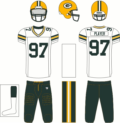
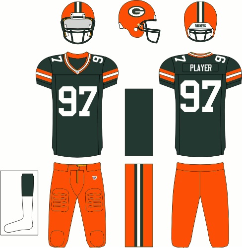
First, some ground rules. Because these are the Green Bay Packers, I oppose any blue uniform design, including the ’30s-era throwbacks. Any uniform that involves any color other than green, gold and white (that includes black, as is apparently depicted at the beginning with the players’ compression shirts, or gray, including gray facemasks) deserves to wind up the victim of your Delete button.
Why not gray facemasks? Because everybody used to have them until technology improved to color the plastic something besides gray. The mere fact everyone used to wear gray facemasks is not a compelling reason to go back to gray, which by the way has never been an official color of the Packers anyway. (The same can be said about black shoes, which make the wearer look slow. However, one compelling reason to wear white shoes — getting the benefit of the doubt on sideline catches because the shoes blend into the sideline paint — has been made pretty obsolete by instant replay.)
I’m also not a fan of the two-tone jersey, even though, yes, they wore those too. That’s a hockey look, not a football look. (Ditto any gold jersey, which is appropriate for the Packer Pro Shop and nowhere else.) And I am particularly not a fan of the head-to-toe monochrome look, especially the white-jersey white-pants combination, which is unflattering to wide players, who end up looking like the Michelin Man.
That’s where I depart from the purists. I do not oppose changing the gold to a metallic, because Lambeau had the Notre Dame gold in mind, but in the era of leather helmets, no one painted helmets. Frankly, “athletic” (that is, slightly redder than yellow non-metallic) gold is boring.
Readers know that Packers general manager Ron Wolf had considered replacing the athletic gold with Notre Dame gold …

… but ultimately decided he had bigger issues to deal with than the PR blowback from changing the gold. I would be fine with changing the gold as long as it didn’t look too brown, like the Saints, or Grey Poupon mustard-ish, like the 49ers.
I also would like to see the Packers adopt matching green pants to go with their white jerseys. The long-time road (except in Dallas) look has very little green in it for Green Bay. Green pants would make the Packers look something like …
I would even be OK with green helmets; that is the least objectionable thing to the first set of designs on this page, although they might then look too much like the Eagles.
Packers Uniforms did its own mild redesign proposal for a contest:


This skirts with, but doesn’t seem to violate, my First Law of Athletic Uniforms: Numbers must be legible. (Gold on dark blue or green, as shown in concept number two, is a potential problem that probably requires a white outline.) I like the takeoff on the wordmark (which is supposed to look like spray-painted stenciling on a crate used by, of course, meat packers), as long as the space splitting the numbers isn’t too wide. As an alternative, the Packers could adopt the font used in the Glory Years, with the weird numbers 3 (shown on Fuzzy Thurston’s jersey) and 5 (on Bart Starr’s, not Paul Hornung’s, jersey).

A similar look comes from Jesse Alkire …

… although he did less work on the numbers than Packers Uniforms did. I would dump the green socks.
For those who looked at Nike’s becoming the official NFL uniform supplier with horror, UniWatch came up with these Packer Nike Combat unis …


… which obviously aren’t radical at all.
One thing several of these proposals have in common — and something the Packers should emulate regardless of what they do with their uniforms — is getting the stripes off the jersey sleeves. The problem is that non-quarterbacks and non-kickers hardly have sleeves anymore, to avoid being held by the arms by their opponents. If you’re going to have jersey sleeves, they either need to be on the cuff of the jersey, or on the compression shirt underneath; otherwise they look bad because there isn’t enough material for them.
The Nike Combat design proposes going back to the days of numbers on the sleeves, which the Packers wore until Forrest Gregg arrived in 1984. Numbers on top of the jerseys are called “TV numbers” for a reason, and there’s a reason only a handful of teams (off the top of my head, Oakland, Washington and the Jets, plus a few teams’ throwbacks) don’t have them.
Finally, I’m surprised someone other than myself hasn’t proposed this look for late November and December, in keeping with two great Wisconsin traditions — the Packers and deer hunting:

Leave a reply to Leon Duquette Cancel reply